
Designing a kitchen is rarely about choosing one feature at a time. It’s more about how everything works together. Cabinets, worktops, flooring, and lighting all play a part, but the splashback is often the element that connects them visually.
Get that balance right, and the kitchen feels cohesive without trying too hard. Get it wrong, and something can feel slightly off, even if you can’t quite put your finger on why.
If you’re trying to figure out how to pair your kitchen splashback with your worktops and cabinets, it doesn’t need to be complicated. A few simple guidelines can help you make choices that feel natural in your space.
Start With One Dominant Feature
It’s much easier to make decisions when you know what you want to stand out.
In some kitchens, that’s the cabinets. Maybe they’re a bold colour or have a distinctive finish. In others, the worktop draws the eye, especially if it has strong veining or texture.
Once you’ve identified that main feature, the splashback becomes easier to choose. Instead of competing with everything else, it can support what’s already there.
For example, if your worktop already has a lot going on, a simple splashback usually works better. If the rest of the kitchen feels quite neutral, the splashback can add a bit more interest.
Matching vs Contrasting: Finding the Balance
A lot of people get stuck deciding whether everything should match or whether they should introduce contrast.
The truth is, both approaches can work. It just depends on the overall look you’re aiming for.
Matching colours or tones creates a softer, more seamless feel. This is common in modern kitchens where the aim is to keep everything calm and uncluttered.
Contrast, on the other hand, adds a bit of depth. It breaks things up slightly and can make each element stand out a little more.
In most kitchens, the sweet spot sits somewhere in between. Not perfectly matched, not too different either. Just enough variation to keep things interesting.
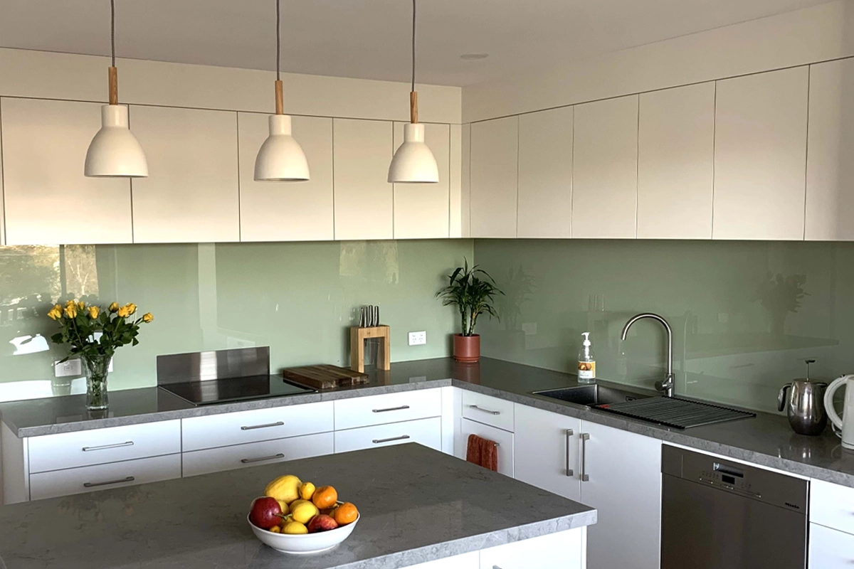
Pairing Splashbacks with Light Cabinets
Light cabinets are probably the easiest to work with. Whites, creams, soft greys, they all give you a lot of flexibility.
If your cabinets are on the lighter side, you can either keep things simple or introduce a bit of colour through the splashback.
A soft coloured glass splashback, something like a muted green or pale blue, can add warmth without taking over the space.
If you prefer a cleaner look, sticking with a neutral splashback keeps everything feeling bright and open. This works especially well in smaller kitchens.
Pairing Splashbacks with Dark Cabinets
Darker cabinets change the mood of a kitchen quite a bit. They feel more dramatic, sometimes a bit more modern too.
The challenge here is making sure the space doesn’t feel too heavy.
A lighter splashback can help lift the overall look. Something like a soft grey or off white glass panel can create contrast without being too sharp.
Mirrored splashbacks also work really well in these kitchens. They reflect light and break up the darker tones, which helps balance things out.
Coordinating with Worktop Materials
Worktops tend to have a strong visual presence, especially if they include patterns like marble veining or stone effects.
If your worktop has a lot of detail, it usually makes sense to keep the splashback fairly simple. A single colour glass splashback often works best in these cases.
If the worktop is more subtle, you’ve got a bit more freedom. You can introduce colour or even go for something slightly more reflective like a mirrored finish.
It’s really about avoiding too many competing elements in the same space.
Using Colour to Tie Everything Together
Sometimes the splashback isn’t there to stand out at all. It’s there to connect things.
If your cabinets and worktops are quite different in tone, the splashback can sit somewhere in between. Not matching either exactly, but helping the transition feel smoother.
For example, a mid tone splashback between light cabinets and a darker worktop can soften the contrast.
Even picking up a small tone from the worktop or cabinet colour can make the whole kitchen feel more cohesive.
Considering Light and Space
Lighting changes everything. Colours that look perfect in a showroom can feel completely different once they’re in your kitchen.
If your kitchen doesn’t get much natural light, reflective materials like glass or mirrored splashbacks can help brighten the space slightly.
Lighter colours tend to open things up, while darker tones can add depth if you’ve got enough light to support them.
It’s always worth looking at samples at home rather than relying on how something looks online.
Keeping It Practical
It’s easy to focus on how everything looks, but the splashback still needs to handle everyday use.
Behind the hob, you’ll need something heat resistant, which is why toughened glass or porcelain splashback tends to be a safer choice.
Cleaning is another factor. Smooth surfaces are usually much easier to maintain compared to anything with texture or grout lines.
In the long run, practicality matters just as much as appearance.
Pairing your splashback with your worktops and cabinets isn’t about following strict rules. It’s more about finding a balance that feels right in your space. Once you start looking at how colours, materials and light interact, the decision becomes a bit more natural. And when everything works together, the kitchen just feels easier to live with.
Get in touch with Simply Splashbacks and we’ll help you find a style, colour and finish that works with your cabinets and worktops.